Pages

Friday, September 30, 2011

CASEing Rachel

Rachel's card
This is for today's TGF Farm Fresh Friday challenge - case a card by Rachel (aka AirForceMommy).  Here is the Rachel's card I chose to CASE.  After all, I can't resist a Twilight-inspired card!  I just love her yummy coloring and fantastic highlights in the hair. 

For my card, I chose to use the new TGF Oliver & Amelia Surprise set.  Wanna know how to squish them together?  I used a masking technique.  I stamped Oliver first, then restamped on a piece of post-it note, then cut out and placed over the stamped image.  Next, ink up Amelia, stamp as usual, then remove the mask.  The post it does not leave behind any residue, like other temporary adhesives can.  I stamped the sentiment, then colored with copic markers, using a white gel pen to highlight.  The image is mounted on dimensionals.  The card base is Whisper White with layers of retired SU Pawsitively Prints designer papers.  In place of brads, I used copics to color pearls to coordinate with the papers.  Thanks for looking!  April

Thursday, September 29, 2011

Heart Journal - week 10

Yea, I know I am pushing my luck getting this week done, but inspiration was in short supply.  I feel like I am a bit redundant in techniques right now, so I was not feeling particularly inclined to hustle.  This week's theme is "Torn Between" and we are to create a spread using a tearing technique. 
I sponged the base in Lucky Limeade, Soft Sky and Pool Party.  Next, I stamped the quotes from Twilight on the right side.  I then pulled out some pages from New Moon and Eclipse, crumpled and inked.  I set those aside until I colored my images - TGF's Flirty Edward and Camille (Twilight's Edward and Bella) in copic markers, then cut out.  I used the basic masking technique to overlap the images.  Once they were in place on the sponged background, I ran adhesive around the edges of the spread, then set the crumpled pages over top.  I held them up to a light to find where the images were, then used a needle to create the start of the tear, pulling until the image was exposed.  I used Spica pen to give Edward some sparkle and Versamark to stamp Bella's truck and chess pieces over the text, but it doesn't show well in the photo.  Click on the photo and then zoom in on the bottom left side (the truck) and the right side bottom corner and top right corners (chess, ribbon, flower, apple).  Thanks for looking!  April

Tuesday, September 27, 2011

copic storage idea

So I have started to fill in my copic collection and am always looking for a better way to store it.  I originally bought a copic brand wallet for 36 markers, but filled it in too quickly.  I was hunting for ideas online and saw someone bought a tool bag and filled it in with their plastic holders.  I didn't want a huge basket to store, and I always have caddies I am not using, so I pulled one out and stared at it a bit.  Hmmm, what to do?  While thinking, I kicked a SU box under my table....the box is pretty sturdy, so I started to tear it apart.  I used the one of the box flaps to make the outer part of the organizer, then used another flap to make the dividers, cutting slits for the cardboard running perpendicular to slide in.  The picture here is just a few of my markers, but it is fairly full now.  This soft-sided caddy was from Hobby Lobby and holds roughly 75 markers, plus storage in the pockets around the edge.  I have my copic swatch book in one end pocket, ID labels in another, as well as tools like a white gel pen, colorless blender, etc.  Thanks for looking!  April

Sunday, September 25, 2011

Is it hot?

This is for Anyone for Anya's sketch and TGF's FFF Halloween challenges.
The base is Pumpkin Pie with layers of Cast a Spell retired designer paper, Basic Black and Old Olive.  The image is TGF's Devil Anya digi and is colored with copic markers with accents of glitter added with a glue pen.  The ribbon is orange organza from Michael's.  The sentiment was printed using Twilight font and mounted on a scallop circle.   I also used Martha Stewart's drippy goo punch along the black strip.  Thanks for looking!  April

Saturday, September 24, 2011

Not the right monster?

So my mojo has been a bit lacking and now I am playing catch up... This is for Anyone for Anya's Masculine and Pixie Dust Studio's Round & Round challenges. 
 
The base is Very Vanilla with layers of DCWV's Tattered Time photo stack and Chocolate Chip cardstock.  I used a ticket corner punch then added a few Tim Holtz sprockets.  The image is TGF's Wild Sprout Michael and is colored in copic.  Still not loving the hair, but I am getting better.  Each corner has a clear skittle and the sentiment is typed in Almagro font and punched with the decorative label punch.  Thanks for looking!  April

inside of card

Tuesday, September 20, 2011

White Out

 
This is for TGF's Farm Fresh Friday White Out and Deconstructed Sketch #19 challenges.
Okay, so an all white challenge...hmmmm.  The base is Whisper White with layers embossed with the cuttlebug polka dots and swiss dots folders.  I mounted the base layer then tore down the middle for some contrast.  I wrapped the middle strip with white organza ribbon.  Last, I stamped TGF's Odette (Twilight's Esme) in Versamark, then embossed with antique silver powder and mounted with dimensionals.  I was trying to stay away from black ink...I almost went with Dove Grey, but thought the embossing would have some depth and not let it get lost in the field of white, but not be stark like black ink would.  It was hard to avoid over embellishing to make up for the lack of color, but I sort of like the final product.  Thanks for looking!  April
showing silver

hi circle card

This is for TGF's WOW sketch and Stamptacular Sunday's Just Sayin' challenges. 
The base is Whisper White cardstock cut with the nestabilities scalloped circle die.  I cut two then scored the top edge of one before lining up the scallops and adhering.  Next are layers of scrap designer paper cut with the classic circles and another Whisper White layer cut with the lacy scallop.  The image is TGF's Stampin' Anya colored with copics, cut and embossed with a classic oval nestability, and mounted with dimensionals.  I used a metal rimmed tag and stamped "hi" and tied to one of the scallops.  I finished it with a button tied with twine.  Thanks for looking!  April

Monday, September 19, 2011

Heart Journal - week 9

This week's assignment is "Cut & Paste."  We were asked to center our spread around a head we cut and pasted into the design.  I couldn't just randomly pick a picture and use it, so I started looking around for ideas and kept coming across pics of Barbie...yuck!  I can't stand her.  Sure, I played with them, but she is the most unrealistic creature and the complete opposite of everything I am.  I don't love pink and she is coated in it like Pepto, she's blonde, skinny, etc...yea, not me.
I scribbled pink watercolor pencil  randomly around the page, then went back and filled in the gaps with pink Crayola watercolor, so that it created a two-toned effect.  Next, I spritzed the background with Mixed Berries, Cosmic Pink and Cherry Ice Smooch Spritz, then heat set.  I sponged the edges with Purely Pomegrante.  I found a B&W pic of Barbie and colored her with copics.  I did a really awful job on the makeup, sort of like a kid.  I used a sharpie to write in my own writing.  I added some bling behind Barbie and then colored the gems with a sharpie before attaching to the B.  Thanks for looking!  April

Sunday, September 18, 2011

Sixth Grade

I can't believe my oldest is in Sixth Grade!  It seems like yesterday she was just learning to walk.  Anyway, her fall pics are already back because they needed them for their school IDs. 
The paper was found at my local scrap shop...what's cool is it is two-sided with then next grade on the back.  This one is 5th/6th.  I cut the photo to 8x8 with mats 8 1/2x8 1/2 and 9x9.  I used a zig zag stitch around the outermost layer, then tied a blue polka dot ribbon sewn with a safety pin charm and attached with tacky tape.  Last, I punched a decorative label punch and wrote the school and year before mounting with dimensionals.  Super quick and easy.  Thanks for looking!  April

Thursday, September 15, 2011

Heart Journal - week 8

This week's journal entry is "The power of ONE."  We are to create a spread using a word as the focal point of the design.  So, I started looking for ideas and came across this delicious vinyl sticker from My Mind's Eye in my rub-ons stash.  Hmmm, what can I do with this?  I started looking for quotes...yes, I could have used another Twilight thing, but I wanted it to reflect one of my other loves - Disney!
I painted the base with Apple Pink acrylic paint, then sponged Baby Pink around the edges with a spouncer sponge.  When dry, I used Whisper White craft ink on my new Inkadinkado polka dot background stamp to make random stamps...it is super pale and hard to see at this point.  Next, I crushed a dryer fabric softener sheet to sponge Brilliance Platinum Planet ink around the page.  I used versamark ink to ink up a couple of Mickey Mouse stamps, then embossed with the Deep Impression clear embossing powder and heat set.  Them I placed the vinyl sticker over both pages, using a craft knife to separate the pages.  Next, is a quick spritz of Mixed Berries Smooch Spritz and set with a heat gun.  I then typed the rest of the quote on Whisper White cardstock using Waltograph font from dafont.com.  I cut them into little squares, doodled around the edges, then attached to the page.  I put Walt's name on dimensionals.  Thanks for looking!  April

Sunday, September 11, 2011

Rain, Rain....

This is for TGF's Farm Fresh Friday's Hot or Cold challenge.
The base is retired SU Lovely Lilac with layers of Whisper White and Paper Studio open stock paper.  I used the Martha Stewart lace, EK Success Pinking Hearts and dotted scallop borders.  The sentiment is stamped with studio g dollar alphabet from Michael's on a sheet from the Quotes Smash Pad.  The sentiment card is wrapped with black satin ribbon with a love charm sewn to the bottom.  The charm is from the wedding favors section at Michael's.  The image is Rain Rain digi from TGF and is colored in copic markers.  I drew in the sidewalk and sponged the sky and grass around the digital image before mounting it with dimensionals.  Thanks for looking!  April

Friday, September 9, 2011

Mystery Monday CASE w/ Amy Young

This is for TGF's Mystery Monday CASE and Deconstructed Sketch #18 challenges.  I chose this design because of the bright colors in Amy's card - lots of pink, turquoise, lime, mauve, razzleberry, orange and white.
The base is Tempting Turquoise with layers of Whisper White, Pear Pizzaz, and scrap designer paper left over from a previous challenge.  The border is Martha Stewart's daisy punch.  The image is TGF's Amelia from the O&A Just for You set.  Isn't she darling?  She is colored in copic markers and cut with the nestabilities classic oval die.  The pear layer is embossed with the cuttlebug Swiss Dots folder.  Each layer has wide straight stitches.  Some white grosgrain finishes the card.  Thanks for looking!  April
 

Be Yourself.

This is for Stamp Something's Anything Goes and TGF's WOW Metal Head challenges.
 
Base is Chocolate Chip with layers of My Mind's Eye Magnolia paper (both sides).  I stitched the flower layer to the pink layer on a diagonal after distressing the edges of the paper.  The printed paper is from the Quotes Smash Pad and stamped with a sentiment from SU's Smarty Pants in Azure Blue and Jet Black Staz-On.  I added a bit of Martha Stewart lacy punch border along the sentiment.  The image is Skater Anya from TGF's Later Skater set.  She is colored in copic markers, and cut with multi-layers, mounted with dimensionals.  The first layer is the base image, colored, cut then embossed with the long rectangle nestabilities die.  Next layer is the jeans up to the face and hat, leaving off the sides of the hair, arms, and shoes.  The last layer is the bangs and hat.  I added a bit of bling to the sentiment before wrapping layers of Early Espresso baker's twine with safety pin charms tied along it.  Where the twine crosses, I decided to try using a wax seal.  It is $5 for four sticks and another $5 for the seal.  This seal is done with gold wax and it took some time to get the wick to stay lit, and it doesn't drip like a candle, it is gummy and pools together, but the impression is lovely.  I got it on my first try!  It is a fun effect and I can't wait to use it again.  Thanks for looking!  April

angled to show dimension

Wednesday, September 7, 2011

Heart Journal - week 7

This week's assignment is "Every Cloud has a Silver Lining."  So, make a spread inspired by clouds.  Yea, I could have used the title, but the first thing I thought of was a line from Paramore's Brick by Boring Brick... "keep your feet on the ground when your head's in the clouds." 
The base is Pool Blue acrylic paint with random sponging of antique blue.  Next, I used a very porous sponge to make the white clouds.  After it dried, I used Jet Black and Azure Blue Staz-On to stamp the song lyric.  Fonts are Inkadinkado's curly alphabet and Autumn Leaves scribble alphabet.  "Paramore" is stamped using a studio g font from Michael's dollar bin.  I stamped "head" on a scrap of white cardstock, then cut into a cloud shape, rimmed the edge with a silver pen, then mounted with dimensionals.  Last, a quick spritz of Silver Foil Smooch Spritz finishes the spread.  Thanks for looking!  April

Cheers 4 U!

This is for Anyone for Anya's Back to School and TGF's Farm Fresh Friday's By the Numbers challenges.

The base is Marina Mist with layers of Whisper White, Wild Wasabi, and designer paper from Around the Block.  This is my first gate fold card.  The image is Cheer Anya colored in copic markers and layered at her head and pom poms.  I added a touch of stardust gel pen to add sparkle to her hair and poms.  She is cut out with the classic circle nestabilities die and mounted on the lacy circle cut from Marina Mist then mounted with dimensionals on a band of Wild Wasabi and a cute pre-printed border I found in the clearance of a local scrap shop.  Thanks for looking!  April
inside & band
close up of layers

Monday, September 5, 2011

All-American Boy

This is for Paper Sundae's sketch challenge.
The base is Whisper White with layers of Basic Black and designer paper from Hobby Lobby's Paper Studio open stock.  Once all the layers were set, I used a zig zag and straight stitch around the edges.  Next, I used the notched rectangle die to make a base for the image, embossed, outlined with a white gel pen, then mounted with dimensionals.  The image is Wild Sprout Logan from TGF and is colored with copic markers, then mounted on dimensionals.  I used glue dots to add the gem stars.  The sentiment is printed on cardstock in Impact font and punched using the wide oval punch.  I purposely made it fairly flat for easy mailing.  Thanks for looking!  April

Too Ghoul for School

This is for Deconstructed Sketch #17, Stamptacular Sunday's The Sky's the Limit, Stamp Something's September digi, and Pixie Dust Studio's Back to School challenges.
The base is Basic Black with layers of Old Olive and retired SU Cast a Spell designer paper.  The image is cheer pixie from PDS and is colored with copic markers, then dimmed by going over top with W1.  Wound details were added with sharpies.  The gate is a Martha Stewart border punch wrapped with floss and topped with a black gem.  The image is mounted on dimensionals.  The sentiment is printed on cardstock with Creating Keepsake's chiller font, punched with a wide oval punch and mounted on an Old Olive decorative label punch, mounted on dimensionals.  Thanks for looking!  April

Thursday, September 1, 2011

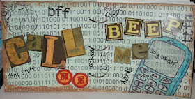
Heart Journal - week 6


This week's Heart Journal assignment is "Text Me!"  We were told to create a spread using primarily text. 
I was really stumped at first, seeing as I did something like this last week.  I almost went back and did a Twilight page, but though...Hmmm.  Well, the first thing to come to mind was the theme song from Kim Possible...Call Me, Beep Me.  I ended up going online and finding binary numbers in a large section, then dropped it in a word processor, printed, then used mod podge to stick it to the base.  I mixed some seafoam acrylic paint in with the mod podge over top and heat set.  Next, I used Toffee acrylic paint to outline the edges.  I used Jet Black Staz-On to ink TGF's Summer from their Roll Call Kit.  The cell phone drawn on tracing paper with a sharpie marker, cut out, flipped over and colored in with watercolor paint, then mod podged into place.  I stamped several sentiments from the Roll Call Kit and a couple of alphabets sets I have.  The titleing is Tim Holtz cardstock stickers.  Thanks for looking!  April
right side
left side