Showing posts with label Heart Journal. Show all posts

Thursday, December 29, 2011

Heart Journal - week 23

This is the last Heart Journal.  I can't believe I made it through all 23 weeks!  Honestly, I feel like it is a major accomplishment, so I am excited to share my last entry.  This week's theme is "A Letter to Myself."
I used Bo Bunny Mamarazzi for the base.  Isn't it fabulous?  I cut a photo/mirror from thin chipboard and used a square nestabilities to cut and emboss the center.  Instead of a photo, I put a piece of foil so to still reflect, but be distorted.  I have a hard time with my looks and have never had a positive view of me or my body, so I decided to reflect that.  On the left side is my title and along the film strip, I wrote some positive things for me to focus on about myself.  The tag next to the "photo" is stamped with $1 set from Target's dollar spot, in Jet Black Staz-On.  I added a silver eyelet in place of the one printed on the tag and tied some jute twine before mounting on dimensionals. 
So, there you have it.  Thanks for taking this journey with me and thanks for looking!  April

Wednesday, December 21, 2011

Heart Journal - week 22

We're in the last two weeks of Heart Journalling over at The Greeting Farm.  I can't believe next week is it and I will actually finish this....Merry Christmas to me!  This week's assignment - Music of My Heart.  We have been asked to create a spread featuring music in some way.  As for me, well, I have NO musical talent - that honor goes to my husband and daughter.  I can proudly say my daughter's ecclectic tastes come from me.  I love country, oldies, broadway, etc...pretty much anything that is not Death Metal or rap.  My MP3 features things like Andrew Lloyd Webber, Seether, Paramore, Brad Paisley, Van Morrison, and Disney - just to name a few. 
The color inspiration came from a Creative Imaginations sticker page I picked up on clearance at Michael's.  It has shades of cream, brown, maroon, silver, etc.  I started my spread by inking the base in CTMH's Brown Bag, then inked the edges in Blazing Red Staz-On.  Next, I went to my sheet music background stamp from Stampabilities and SU's Grunge Rock for the guitar.  I printed words to several songs that speak to me right now... A Thousand Years (Christina Perri - Breaking Dawn), Don't Think I Can't Love You (Jake Owen), All That You Are (Goo Goo Dolls - Transformers), and Get It Right (Glee Original Song).  They are inked and stamped with the same two colors.  The checker stamp is also from SU's Grunge Rock.  The finishing touch is a few stickers from the Creative Imaginations sheet.  Thanks for looking!  April

Sunday, December 11, 2011

Heart Journal - week 21

This week's Heart Journal assignments is "I LOVE..." - create a spread about someone or something you love.  Well, there are a lot of things I love in my life, so...
The base is sponged in Purely Pomegrante, Wisteria Wonder, Tempting Turquoise, Calypso Coral, and Green Galore.  The circles are from Autumn Leaves, stamped in Jet Black Staz-On, and accented with white gel pen.  I used multiliners in .02, .05, and .08 to doodle the lines, border, title and writing.  Last, I spritzed it with Vanilla Shimmer and Spun Sugar Smooch and heat set.  Thanks for looking!  April

Sunday, December 4, 2011

Heart Journal - week 20

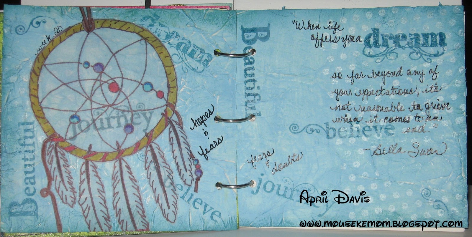
This week's Heart Journal assignment is "Dreams": create a spread based on a dream, goal, or wish.  I have had some weird dreams lately, so I decided to go more broad.  I started searching ideas on the internet and then looked at images.  When I saw a dreamcatcher, I started looking at them specifically.  Some are so simple and others are really detailed.  So, I decided to use one in my design.
The base is mod podged tissue paper that is crinkled and then painted with a coat of Regency Blue acrylic paint.  Once set, I stamped the background with a script and sheet music (Stampabilities) in Pool Party ink.  Next is a Inkadinkado polka dot stamp in Brilliance Moonlight archival ink.  I inked the edges in Island Indigo ink, then stamped with words from Michael's dollar bin.  The dream catcher is sketched on vellum, then colored on the back with Sharpie markers.  I cut it out and ran it through a Xyron sticker maker.  I purposely placed it so one of the words showed through the vellum.  Last was a few words written by hand and a favorite quote from Twilight.  Thanks for looking!  April

Sunday, November 27, 2011

Heart Journal - week 19

Ahhh, we are in the final month of TGF's Heart Journal challenge.  This week's challenge is "Chaos" - no neatness allowed!  Yea, I am one to go tidy, so this was a challenge. 
I started with Tim Holtz tissue tape and overlapped and skewed them.  Next, I made a wash with Kelly Green acrylic paint and water.  (I don't use green often, so I purposely picked it to work with.)  I tried to darken the edges a bit and lighter in the middle.  Once that dried, I used a polka dot stamp from SU and Wild Wasabi to stamp the bottom and sides, with a random one tossed in on top, then inked the outer edges.  I used the Tim Holtz clock and gears masks, dousing them in Silver Foil Smooch Spritz.  Once dried, I added the title with Tim Holtz tile stickers and -for some complete randomness- I added a blinged cherry decal.  It makes absolutely no sense, but that's part of the idea, right? 
What's really funny is this sort of started as either a distressed, aged piece, or a vintage Halloween thing, but it went a totally different direction as I started working.  In the end, it turned out ecclectic and kinda cool, if I do say so myself.  Thanks for looking!  April

Wednesday, November 23, 2011

Heart Journal - week 18

This week's Heart Journal assignment is "Parents" - make a spread centered around your parents, life as a parent or parents in general.  One of my favorite quotes is from "Fern Gulley: The Last Rainforest" and it says "We didn't inherit the earth from our parents; we borrowed it from our children."  I took that a step further and made my spread centered around the concept of Mother Earth. 
I found this fantastic image in several places online, but did not find who to credit it to.  I transfered the basic sketch by pencil, then filled in with sharpie.  Next, I found another image with a fetus inside the planet Earth, shrunk it and incorporated it into the sketch.  I filled it in with acrylic paints.  Once the planet portion dried, I used a spouncer to add in white clouds.  For the darkest blue, I used a stencil brush and pounced it to give it some texture.  The next step was to make stars with some glitter paint.  Once set, I spritzed the entire spread with Vanilla Shimmer Smooch and heat set it.  I used a silver marker to write the quote.  I am not a fan of free-hand drawing or painting, so this was well out of my comfort zone.  It took a lot of time, but the effect is really nice.  Thanks for looking!  April

Wednesday, November 16, 2011

Heart Journal - week 17

This week's Heart Journal assignment is "Soul Food" - create a spread around a favorite food or drink.  My absolute favorite treat...See's Candies.  YUMMY!  Of course, I don't live anywhere near one, so I have to rely on the kindness of my mother to send them as a special treat from time to time...and are they coveted when a box arrives. 
I watered down some Pool Blue, Pumpkin and Butter Apple Barrel acrylic paints and tried to make an effect of a sunset (I was out of purple).  I used the snow writer paint and spread with my fingers to make some dimensional clouds.  I found some pics of my favorite varieties of See's and printed them on cardstock, before running them through my Xyron sticker maker.  Next is a fine liner to draw the strings, write names, and doodle the title.  Thanks for looking!  April

Tuesday, November 8, 2011

Heart Journal - week 16

Yay, I'm ahead of the curve this week!  Missing the deadline last week has had me falling all over not to miss another one.  This week is "Heart to Heart" - create a spread using hearts or have a "heart to heart" with your soul.  Yea, not one of my preferences right now...it will only lead to ugly things. 
So here it is...
I printed the words to the new Christina Perri song "A Thousand Years" in Tall Paul font .  I cut a heart out of a sheet of paper to make a stencil, then inked with Soft Sky and Purely Pomegrante.  On the right side, I used CTMH's Brown Bag to ink the tree from SU's Season of Friendship.  The leaves are stamped in Whisper White craft, then embossed with Silver and Gold metallic embossing powder.  After the embossing set, I went back and stamped hearts from SU's Things I Love set in Purely Pomegrante.  Sweet and simple!  Thanks for looking!  April

Thursday, November 3, 2011

Heart Journal - week 15

Can you believe I couldn't remember it is Thursday?  Yea, I messed up and forgot my Heart Journal.  This week is "Stickin' To It".  Hmmm, well, what to do?  I decided to do another Twilight inspired page.  I wanted a vintage feel with some wedding type momentos. 
The base is painted in Toffee, then a layer of Eggshell Creme with some Elmer's white glue mixed in.  I was hoping it would crack more, but still got a bit of a weathered look, so it's okay.  I sanded the edges, then stamped some flourishes in Timber Staz-On, adding some pearls to the design.  The characters, TGF's Wild Sprouts Edward and Camille, are also stamped in Timber on Very Vanilla, then colored in pencils.  I used the ticket corner punch and mounted on Chocolate Chip.  I used some Tim Holtz brand itmes - mini paper clip, sentiment tag, jounalling tags, tiny attacher, film strip ribbon, tissue tape, and date stickers, throughout the design.  The journalling tags have Bella & Edward's initials stamped from Studio g dollar acryllic stamps from Michael's.  Thanks for looking!  April

Thursday, October 27, 2011

Heart Journal - week 14

This week's Heart Journal is "Two-Toned."  Yea, not terribly inspired for this one...until...I was coloring some of my Wild Sprouts!  The Greeting Farm has the super cute, cheeky little guys and gals and some of them are Twilight inspired.  Of course, with the newest installment ready to head to the theaters, I couldn't resist!  These two are Summer and Paul and have been colored in copic markers.  Don't they make a cute Jessica Stanley and Michael Newton?  The base is watered down Sunny Yellow acryllic paint that has been spritzed with Gold Glow and Sea Breeze Blue Smooch Spritz.  The lettering is Cricut's Base Camp for the "Forks High".  The quotes for each character come directly for a copy of Twilight and I tried to give them signatures that seem like the character.  Thanks for looking!  April

Monday, October 17, 2011

Heart Journal - week 13

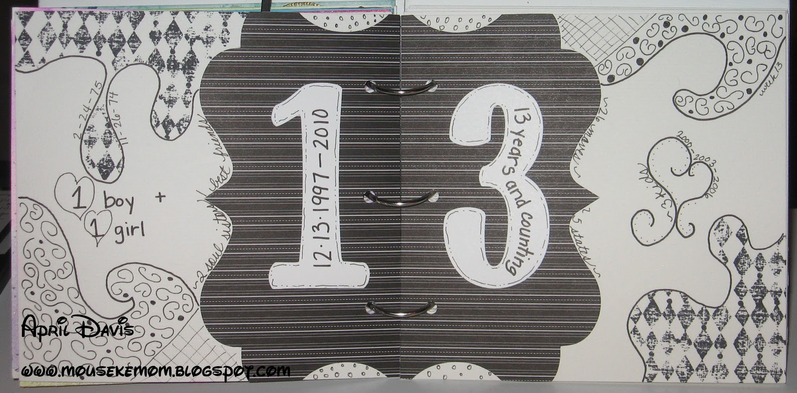
This week's Heart Journal assignment is "Lucky Number."  Create a spread featuring a specific number.  There are lots of numbers in my life, but the most important number right now is 13.  It is the day of the month I married my husband and we have been married 13 years this year.  My husband is my one and only love.  I have three kids, each born 3 years apart.  I have 2 best friends/sister of my heart.  So, I chose to use all black and white with lots of doodles around a 6x6 cut out I got at my LSS.  The number 13 is cut from Cricut's Don Juan font in Whisper White.  The diamonds are stamped with the patterned stamp from SU's Grunge Rock in Jet Black.  Thanks for looking!  April

Sunday, October 9, 2011

Heart Journal - week 12

This week's assignment is "Watercolor Wonder".  I spritzed the base paper with water, then used Crayola watercolor paints to color the base.  Next, I used a Tim Holtz mask with Silver Foil Smooch Spritz on opposite corners, and heat set.  I used an ultrafine multiliner to write song lyrics around the edge.  The die cut ballerina is from Cricut and cut in Basic Black.  The sentiment is stamped with CTMH's giggle lower case in Wisteria Wonder and Cricut's Ashlyn's Alphabet with Paper Studio designer paper.  Thanks for looking!  April

Wednesday, October 5, 2011

Heart Journal - week 11

This week's Heart Journal assignment is "Bloom & Grow."  We are asked to create a spread using the concept of growth.  I inked the base in Lucky Limeade, Pool Party, and Wisteria Wonder inks.  Next, I used the snow writer to sponge fluffy dandelion weeds, using a fine tip sharpie to draw stems and add detail to help them stand out.  The flowers are hand-cut hearts from scraps of DCWV Christmas paper.  I used a black multi-liner to add petal details and Red Riding Hood baker's twine to make the little bows, attached with glue dots.  The sentiment is stamped with CTMH's giggle lowercase in Blazing Red Staz-On and hand doodled with lilac sharpie.  Thanks for looking!  April

Thursday, September 29, 2011

Heart Journal - week 10

Yea, I know I am pushing my luck getting this week done, but inspiration was in short supply.  I feel like I am a bit redundant in techniques right now, so I was not feeling particularly inclined to hustle.  This week's theme is "Torn Between" and we are to create a spread using a tearing technique. 
I sponged the base in Lucky Limeade, Soft Sky and Pool Party.  Next, I stamped the quotes from Twilight on the right side.  I then pulled out some pages from New Moon and Eclipse, crumpled and inked.  I set those aside until I colored my images - TGF's Flirty Edward and Camille (Twilight's Edward and Bella) in copic markers, then cut out.  I used the basic masking technique to overlap the images.  Once they were in place on the sponged background, I ran adhesive around the edges of the spread, then set the crumpled pages over top.  I held them up to a light to find where the images were, then used a needle to create the start of the tear, pulling until the image was exposed.  I used Spica pen to give Edward some sparkle and Versamark to stamp Bella's truck and chess pieces over the text, but it doesn't show well in the photo.  Click on the photo and then zoom in on the bottom left side (the truck) and the right side bottom corner and top right corners (chess, ribbon, flower, apple).  Thanks for looking!  April

Monday, September 19, 2011

Heart Journal - week 9

This week's assignment is "Cut & Paste."  We were asked to center our spread around a head we cut and pasted into the design.  I couldn't just randomly pick a picture and use it, so I started looking around for ideas and kept coming across pics of Barbie...yuck!  I can't stand her.  Sure, I played with them, but she is the most unrealistic creature and the complete opposite of everything I am.  I don't love pink and she is coated in it like Pepto, she's blonde, skinny, etc...yea, not me.
I scribbled pink watercolor pencil  randomly around the page, then went back and filled in the gaps with pink Crayola watercolor, so that it created a two-toned effect.  Next, I spritzed the background with Mixed Berries, Cosmic Pink and Cherry Ice Smooch Spritz, then heat set.  I sponged the edges with Purely Pomegrante.  I found a B&W pic of Barbie and colored her with copics.  I did a really awful job on the makeup, sort of like a kid.  I used a sharpie to write in my own writing.  I added some bling behind Barbie and then colored the gems with a sharpie before attaching to the B.  Thanks for looking!  April

Thursday, September 15, 2011

Heart Journal - week 8

This week's journal entry is "The power of ONE."  We are to create a spread using a word as the focal point of the design.  So, I started looking for ideas and came across this delicious vinyl sticker from My Mind's Eye in my rub-ons stash.  Hmmm, what can I do with this?  I started looking for quotes...yes, I could have used another Twilight thing, but I wanted it to reflect one of my other loves - Disney!
I painted the base with Apple Pink acrylic paint, then sponged Baby Pink around the edges with a spouncer sponge.  When dry, I used Whisper White craft ink on my new Inkadinkado polka dot background stamp to make random stamps...it is super pale and hard to see at this point.  Next, I crushed a dryer fabric softener sheet to sponge Brilliance Platinum Planet ink around the page.  I used versamark ink to ink up a couple of Mickey Mouse stamps, then embossed with the Deep Impression clear embossing powder and heat set.  Them I placed the vinyl sticker over both pages, using a craft knife to separate the pages.  Next, is a quick spritz of Mixed Berries Smooch Spritz and set with a heat gun.  I then typed the rest of the quote on Whisper White cardstock using Waltograph font from dafont.com.  I cut them into little squares, doodled around the edges, then attached to the page.  I put Walt's name on dimensionals.  Thanks for looking!  April

Wednesday, September 7, 2011

Heart Journal - week 7

This week's assignment is "Every Cloud has a Silver Lining."  So, make a spread inspired by clouds.  Yea, I could have used the title, but the first thing I thought of was a line from Paramore's Brick by Boring Brick... "keep your feet on the ground when your head's in the clouds." 
The base is Pool Blue acrylic paint with random sponging of antique blue.  Next, I used a very porous sponge to make the white clouds.  After it dried, I used Jet Black and Azure Blue Staz-On to stamp the song lyric.  Fonts are Inkadinkado's curly alphabet and Autumn Leaves scribble alphabet.  "Paramore" is stamped using a studio g font from Michael's dollar bin.  I stamped "head" on a scrap of white cardstock, then cut into a cloud shape, rimmed the edge with a silver pen, then mounted with dimensionals.  Last, a quick spritz of Silver Foil Smooch Spritz finishes the spread.  Thanks for looking!  April

Thursday, September 1, 2011

Heart Journal - week 6


This week's Heart Journal assignment is "Text Me!"  We were told to create a spread using primarily text. 
I was really stumped at first, seeing as I did something like this last week.  I almost went back and did a Twilight page, but though...Hmmm.  Well, the first thing to come to mind was the theme song from Kim Possible...Call Me, Beep Me.  I ended up going online and finding binary numbers in a large section, then dropped it in a word processor, printed, then used mod podge to stick it to the base.  I mixed some seafoam acrylic paint in with the mod podge over top and heat set.  Next, I used Toffee acrylic paint to outline the edges.  I used Jet Black Staz-On to ink TGF's Summer from their Roll Call Kit.  The cell phone drawn on tracing paper with a sharpie marker, cut out, flipped over and colored in with watercolor paint, then mod podged into place.  I stamped several sentiments from the Roll Call Kit and a couple of alphabets sets I have.  The titleing is Tim Holtz cardstock stickers.  Thanks for looking!  April
right side
left side

Tuesday, August 23, 2011

Heart Journal - week 5

This week's theme is "Pieces of Me."  We needed to layer or paper piece somewhere along the LO.  I wanted to focus on one specific part of me.  You all see my creative side all over my blog, so I decided to go with something you may not know...my love of reading.  Even now, I love to read children's books.  Some that didn't make it on the LO include: Pigs Might Fly, Buffy the Vampire Slayer, Players in Pigtails, The Bone Collector, and many, many more. 
The base of the LO is ripped up pages from the Twilight Saga books.  No, I did not kill my prized copies...I bought second-hand ones that were already falling apart for $2 each.  I ripped out different pages, picked some cool passages, inked with CTMH's Brown Bag ink, crumpled and distressed.  I glued it down with Mod Podge, then set with a heat gun.  Next, I trimmed around the edges of the LO and chalked with Chestnut Roan cat's eye chalk.  I tracked down several pics of some of my favorite books then printed on cardstock, then ran them through the Xyron stickermaker to evenly distribute adhesive.  The truck is from SU's Loads of Love and is stamped in Whisper White craft ink on Basic Black cardstock and Jet Black Staz-On on Really Rust, mounted on dimensionals.  The title is made with rub-ons, using a white gel pen to add the subtitle.  Thanks for looking and leave me a comment with a favorite childhood book or book recommendation!  April
left side
right side


Friday, August 12, 2011

Heart Journal - week 4

This week's heart journal assignment is "The Girl in Me..."  We are supposed to sketch some kind of girl and I will be the first to say, I stink at free hand.  With that said, I did some looking around the internet and then started digging through book covers in our library and I found....Esperanza Rising by Pam Munoz Ryan.  So I pulled the pic and blew it up a bit and then traced the rough sketch onto my page.  Once that was done, I went over it in a multiliner, erasing the pencil marks.  Next, I sponged the background and tried to leave a bit of a halo around the image.  The sponged colors are Soft Sky, Green Galore, Pool Party, and Wisteria Wonder.  The image is filled in with watercolor pencils, then I used a water-filled brush to blend.  Once that was done, I took part of the chorus to Jessica Andrew's Who I Am to weave through her hair.  The title is Inkadinkado's Curly Alphabet in Jet Black Staz-On.  Thanks for looking!  April